It is time for the Dwarfs to get the name-generator treatment. Scouring the full ranges of Citadel Miniature Dwarfs from 1982-1986 to compile a random name generator for dwarf-kind.
The Dwarf name generator is already plugged in to the
Oldhammer Scenario Generator on Twitter which has introduced us to the exploits of such hallowed dwarfs as Gorin Dragonhammer and Owd Ketri Stoneaxe, and I also used it to create the name for a D&D character Lard Hookbeard for Bones of the Lost God.
Warhammer Dwarf Name Generator
Or if the trans-dimensional portal
iframe above isn't working visit :
Ye Olde Oldhammer Dwarf Name Generator It can be a little repetitive, but that's not always a bad thing, as our obligitary journey through the hallowed halls of ancient dwarven kings shall reveal.
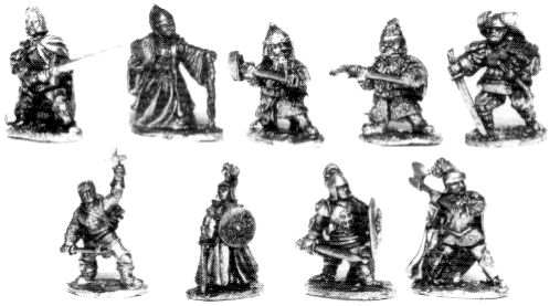
The Dwarf Kings Court
Venerable themed box set from 1982, Sculpted by Micheal and Alan Perry. I can't help but imagine this was originally designed as a chess set, with the king and queen, the wizard and jester as bishops, the guards as knights, the bear and blacksmith as rooks, axe-weilder as pawn etc.
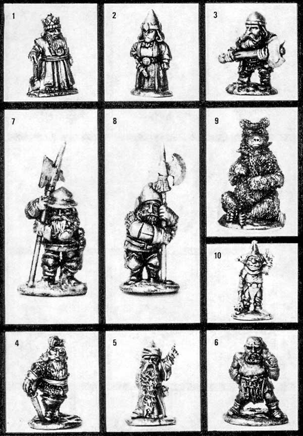 |
| SS2 Dwarf Kings Court |
| SS2 Dwarf Kings Court | King | Dumin | Ironbeard | |
| SS2 Dwarf Kings Court | Queen | Asabelle | Dragonsmiter | |
| SS2 Dwarf Kings Court | | Fungil | Wisebeard | The Sage |
| SS2 Dwarf Kings Court | | Quintin | Limpfondle | Queen's Champion |
| SS2 Dwarf Kings Court | | Orizard | Oldrock | |
| SS2 Dwarf Kings Court | | Bomban | Ironbeater | Royal Armourer |
| SS2 Dwarf Kings Court | | Corbit | Shortstuff | |
| SS2 Dwarf Kings Court | | Mimbrin | | Royal Guard |
| SS2 Dwarf Kings Court | | Dimgol | | Master of The Guard |
We delve straight into the use of epithetical compound nouns - Wise-beard, Dragon-smiter etc. as we have seen with
Orcs,
Elves and
Chaos Warriors Iron, rock, dwarf characteristic association with mining, and
Dragonsmiter highlighting the Dragon as a name-worthy foe - the dwarf/dragon connection runs through the Icelandic
Volsunga Saga, Wagner's
Sigfried and Tolkien's
Hobbit. Other names of interest include:
- Mimbrin - the dwarf Mim from the Silmarillion.
- Fungil - Fundin from the Dvergertal / Lord of the Rings.
- Bomban - a corruption of Bombur, from the Dvergatal / The Hobbit
- Asabelle - using the French for 'beauty', typical English associations of French with femininity
- Corbitt Shortstuff - reference to comedian Ronnie Corbett
, the Gnome jester not only provided the name, but design for the miniature seems to be based on one half of the comedy duo The Two Ronnies, Ronnie Corbett, who habitually made jokes about his own short stature:
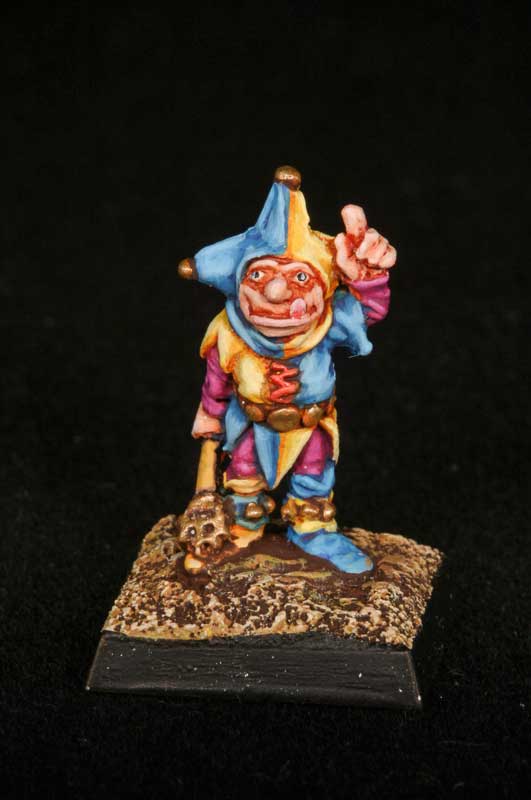 |
Corbett Shortstuff painted by Steve Mussared via
|
 |
| Ronnie Corbett |
I think the bulging eyes on the miniature are supposed to be Ronnies glasses, but I haven't seen the figure in hand, so can't really make a judgement. The poking out tongue is more a Benny Hill than Corbett expression, but a jester named Corbett is a clear homage that would have been easily identifiable in the early 1980s.
Quintin Limpfondle, Queens Champion is sporting the impressively baroque coiffure reminiscent of
Quentin Crisp.
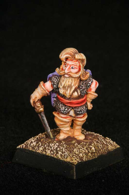 |
| Quintin Limpfondle painted by Steve Mussared via |
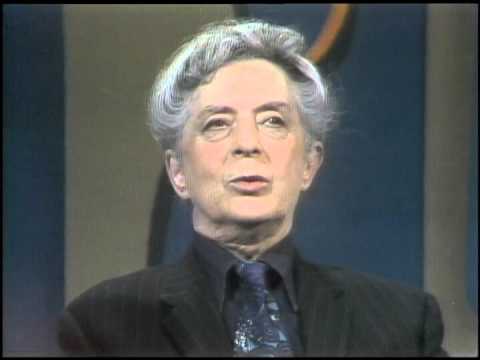 |
| Quentin Crisp |
If Quintins rather camp tea-pot pose with hand on hip and impressive bouffant do indeed indicate a reference to
Quentin Crisp - the title "Queen's Champion" becomes a punning reference to Quentins homosexuality and public championship of gay rights, a literal champion of queens. The surname Limpfondle is perhaps an unpleasant jibe against Quentins effeminate persona,
limp-wristed being a once common euphemism for a camp or effeminate homosexual, and
fondle being intimate touching. Dwarves, as their mascot
Cyril the Bear clearly demonstrates tend to be more rugged, masculine, if somewhat short, Bear types.
The Dwarf Adventurers
Odan and
Olaf, unashamedly Norse in inspiration, Odan perhaps being a corruption of the Norse God Odin, and Olaf being a common old-norse given name. Indirectly we also have
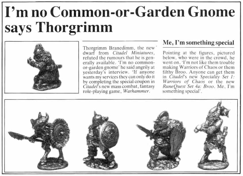
Thorgin and the first use of a patronymic '-son' to delinate heritage, adding an ancestral, lineage tradition to Dwarf naming along side the more common compound nouns.
Thorgrim Branedimm, Brain-dim, obviously a stupid fellow. Thor-grim, perhaps related to Thorgin, but similarly evoking the Norse God Thor, and well, being grim. In the grim dwarf history of the ancient gods there is only Thor. Or something. A rare miniature, representing the leader of the dwarfs in the Warhammer 1st Edition Scenario
The Ziggurat of Doom and offered as a free figure with proof of purchase. Maybe a reference to Thorgrim from the 1982 swords and sorcery movie
Conan the Barbarian.
 |
| Thorgrim vs. Conan |
Drambuin a pun on Drambuie - a whiskey liqure, with a Tolkiensque air - Baranduin being the name of the Hobbitified 'Brandywine' River in the Shire from The
Lord of The Rings. It is also, unabashedly Scottish, and I believe, the first Scottish-accented Dwarf reference we have outside of
Ronf from Noggin The Nog.
 |
| Vintage 1970s bottle of Dwarf Liquor |
But evidently, this idea of connecting dwarfs with booze caught on around the Citadel Miniatures studios, as the next named release is that all time renowned regiment, Bugmans Dwarf Rangers.
Bugmans Dwarf Rangers
 |
| Joseph Bugman from Forces of Fantasy, by Tony Ackland |
| RR1 Bugmans Dwarf Rangers | | Joseph | Bugman |
| RR1 Bugmans Dwarf Rangers | | Jeorj | Ruddle |
| RR1 Bugmans Dwarf Rangers (1986 re-release) | Owd | Tom | Thyksson |
The Dwarven Battlecry of "Mhinz Abeir, Z'yor Rond" ("Mine's a beer, it's your round") cements the regiments place in the annals of Warhammer puns, and underlines the theme of dwarfs as heavy drinkers.
- Jeorj Ruddle is a reference to George Ruddle, the founder of Ruddles Brewery, now a brand name of Green King, with neither the recipies or brewery location having any connection to the original.
- Tom Thyksson appears to be a reference to Theakstons brewery, and particually the 'Owd' being their legendary brew Old Peculiar.
- Joseph Bugman appears to be an original invention, who continues today with the beers sold in Warhammer World Dwarf themed ales from Nottingham Brewery
Perhaps significantly Joseph and Tom are not fantasy misspellings like Jeorj or loosely based on Norse myth or it's Tolkien derivatives but just common English names. The case for dwarfs adopting common names from human cultures is made by Tolkien, whose dwarfs have their own 'secret' names in the dwarf language Khudzul, but for day-to-day purposes use a human name, although Tolkiens human-language names are Old Norse, rather than English. More on that later...
The Dwarf Lords of Legend
Sculpted by Michael and Alan Perry, the Dwarf Lords of Legend were released in 1985 as a boxed set containing 8 individual characters.
 |
| Dwarf Lords of Legend Box Art | John Blanche |
| BC3 Dwarf Lords of Legend | | Borax | Bloodaxe | |
| BC3 Dwarf Lords of Legend | | Angus | | |
| BC3 Dwarf Lords of Legend | | Throbin | | Death Eye |
| BC3 Dwarf Lords of Legend | | Kimril | | Giantslayer |
| BC3 Dwarf Lords of Legend | | Lastro | Lupintal | |
| BC3 Dwarf Lords of Legend | King | Gorin | | |
| BC3 Dwarf Lords of Legend | | | | The Baron |
| BC3 Dwarf Lords of Legend | | Uther | | |
- Borax is a chemical cleaner.
- Angus, a stereotypically Scottish name.
- Throbin, a pun on thobbing, with slight reference to Thorin from Dvergertal/Hobbit
- Lupintal - Lupin Tall - tall as a lupin?
- Uther - Uther Pendragon, legendary King and father of King Arthur.
Along with the designs, get the feeling that this boxed set encompassed many of the different cultures of Dwarfdom around the Old World from the Norse to the Imperial to the Scots.
C06 Northern Dwarfs
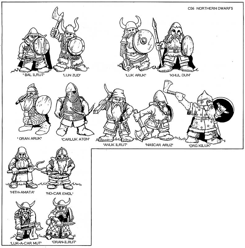 |
| C06 Northern Dwarfs | 1984 flyer |
| C06 Northern Dwarfs | | Bal | Irut |
| C06 Northern Dwarfs | | Lun | Zud |
| C06 Northern Dwarfs | | Luk | Aruk |
| C06 Northern Dwarfs | | Khul | Dun |
| C06 Northern Dwarfs | | Oran | Aruk |
| C06 Northern Dwarfs | | Carluk | Aton |
| C06 Northern Dwarfs | | Anuk | Ilrut |
| C06 Northern Dwarfs | | Nazcar | Aruz |
| C06 Northern Dwarfs | | Org | Kiluk |
| C06 Northern Dwarfs | | Hith-amata | |
| C06 Northern Dwarfs | | No-car | Emol |
| C06 Northern Dwarfs | | Luk-a-car | Mut |
| C06 Northern Dwarfs | | Oran-ilrut | |
Several of the Northern Dwarf names appear to be car puns, Luk-a-car Look a Car? Nazcar? Oran Aruk Or Anorak?
What's strange about
Northern Dwarves, is that we already have 'northern' names from Bryan Ansells Heroic Adventurers boxed set -
Olaf, and
Odan. But rather than continue the nordic theme, the Northern Dwarfs have short, gutteral, and sharp names, perhaps inspired by Tolkiens invented dwarf language Khudzul. If we focus on the examples of Khudzul as they appears in
The Lord of the Rings:
- Baruk Khazâd! Khazâd ai-mênu!
- Balin Fundinul uzbad Khazad-dûmu
- Azanulbizar
- Kheled-zâram
- Mazarbul
- Barazinbar
- Bundushathur
- Kibil-nâla
- Tharkûn (Gandalf)
- Zirak-zigil
Whilst by no means a reconstructive extension of Tolkiens constructed language, there are features in the Citadel Northern Dwarf that are familiar: the use of hyphenations, frequent uses of 'z' and 'kh' 'uk', 'bal', Thematically Tolkien has Khudzul as a secret language, and that Dwarves commonly take on names from their surrounding cultures, so would typically choose a 'human' name for use outside the secret halls of dwarfdom. As such these names don't appear in the generator, which only produces outward facing names.
C06 Imperial Dwarfs
The Imperial Dwarves, as opposed to the Norse Dwarfs and the Chaos Dwarfs (who deserve a separate enquiry altogether), again sculpted by Micheal and Alan Perry, released in 1986.
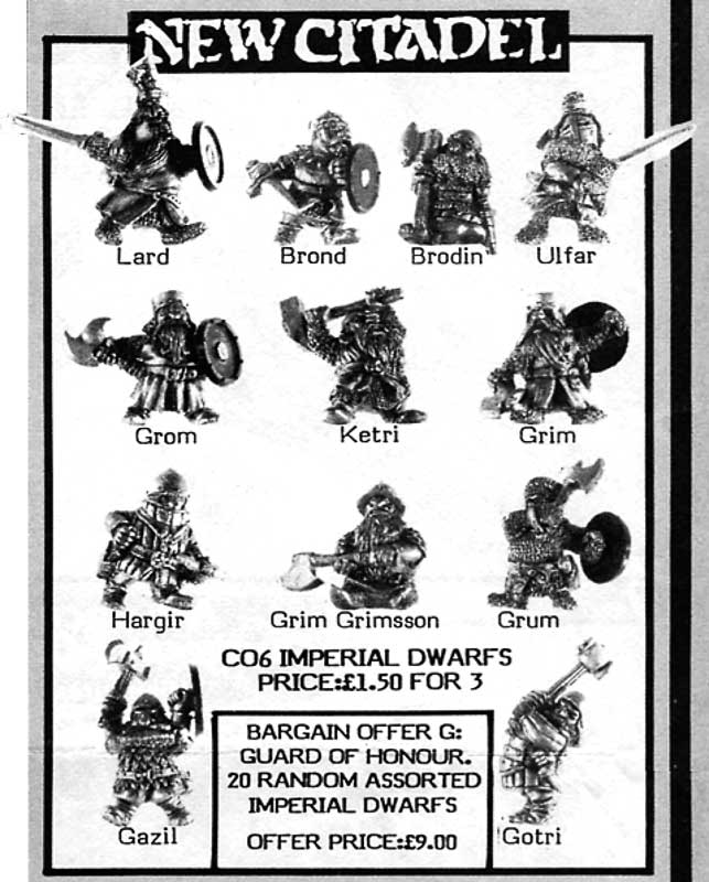 |
| August 1986 Flyer |
| C06 Imperial Dwarves | | Lard | |
| C06 Imperial Dwarves | | Brond | |
| C06 Imperial Dwarves | | Brodin | |
| C06 Imperial Dwarves | | Ulfar | |
| C06 Imperial Dwarves | | Grom | |
| C06 Imperial Dwarves | | Ketri | |
| C06 Imperial Dwarves | | Grim | |
| C06 Imperial Dwarves | | Hargir | |
| C06 Imperial Dwarves | | Grim | Grimson |
| C06 Imperial Dwarves | | Grum | |
| C06 Imperial Dwarves | | Gazil | |
| C06 Imperial Dwarves | | Gotri | |
And because there is overlap, here's some more...
White Dwarf 80 Imperial Dwarfs
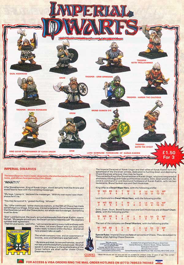 |
| Imperial Dwarfs | White Dwarf 80 |
| Imperial Dwarfs | | Gazil | Hooknose | |
| Imperial Dwarfs | | Grum | | |
| Imperial Dwarfs | Trooper | Grim | Grimson | |
| Imperial Dwarfs | Trooper | Ketri | Trollhammer | |
| Imperial Dwarfs | Trooper | Bromi | Iornbeard | |
| Imperial Dwarfs | | Grom | | |
| Imperial Dwarfs | | Brond | Sunkeneye | |
| Imperial Dwarfs | Trooper | Hargir | | The Cautious |
| Imperial Dwarfs | King | Ulfar | Stonehammer | of Karak Ungor |
| Imperial Dwarfs | | Grim | | |
| Imperial Dwarfs | | Lard | Gormund | of Karak Kadrin |
| Imperial Dwarfs | Trooper | Gotri | The Stout | |
Again we have the epithetical compound nouns, Stone-hammer, Hook-nose, and the appearance of Troll as a name-worthy enemy.
Lard Gormund is notable as Lard, rendered pig fat, and Gormund, like Gourmand, a glutton.
We also have
Grim Grimson, who we may safely assume is son of
Grim, building the familial relationship between the characters, helping establish the sense of dwarven clannishness.
There is also the first apearance of tying the name to specific place.
Karak Ungor and
Karak Kadrin. Which with the proponderance of K's seems vaguely deriviative of Tolkiens Khudzul
.The Karaks as names of dwarven strongholds go back to the first edition of Warhammer Fatnasy Battle, with Caraz-A-Carak (
Car has a car rack?). Seems a bit of a asted opportunity not to keep throwing puns in there, Karak-Akan, Karak-Agax or Karak-Edz. Karaz-A-Rufrak.
With, Grim, Grom, Grum, Gotri, Ketri there is an alliterative naming convention that we see in Tolkiens Hobbit, which stems from the Dvergatal in the Völuspá, a poem that catalogues and names the Dwarfs.
Dvergatal, or "The Recounting of the Dwarves".
There was Motsognir the mightiest made
Of all the dwarfs, and Durin next;
Many a likeness of men they made,
The dwarfs in the earth, as Durin said.
Nyi and Nithi, Northri and Suthri,
Austri and Vestri, Althjof, Dvalin,
Nar and Nain, Niping, Dain,
Bifur, Bofur, Bombur, Nori,
An and Onar, Ai, Mjothvitnir.
Vigg and Gandalf, Vindalf, Thrain,
Thekk and Thorin, Thror, Vit and Lit,
Nyr and Nyrath, now have I told
Regin and Rathsvith the list aright.
Fili, Kili, Fundin, Nali,
Hepti, Vili, Hannar, Sviur,
Billing, Bruni, Bildr and Buri,
Frar, Hornbori, Fræg and Loni,
Aurvang, Jari, Eikinskjaldi.
The race of the dwarfs in Dvalin's throng
Down to Lofar the list must I tell;
The rocks they left, and through wet lands
They sought a home in the fields of sand.
There were Draupnir and Dolgthrasir,
Hor, Haugspori, Hlevang, Gloin,
Dori, Ori, Duf, Andvari,
Skirfir, Virfir, Skafith, Ai.
Alf and Yngvi, Eikinskjaldi,
Fjalar and Frosti, Finn and Ginnar;
So for all time shall the tale be known,
The list of all the forbears of Lofar.
The list of Dwarf names was used by Tolkien in
The Hobbit, and indeed John Rateliff in
The History of the Hobbit speculates, with good textural reasoning, that one of the chief inspirations for the story was Tolkien working out why an Elf - Gandalf, that is a "Wand-elf" is travelling with all these dvergr.
Another of Tolkiens creative interpretations was to make the similar sounding names indicate familial relations. So, for example Oin and Gloin became brothers, and this idea of a familial structure being important to Dwarfs surfaces with
Grim Grimson and the next wave of dwarf.
RR6 Prince Ulthers Dragon Company
 |
| Prince Ulther's Imperial Dwarfs |
| King | Ulther | | son of Ulfar of Karak-Ungor |
| Borri | Forkbeard |
|
Both
Ulther and
Borri, have a traditional Northern feel, Ulther via Uther Pendragon, and
Borri not being far removed from the Ori, Norri and Dori of the Dvergertal.
King Ulther, son of Ulfar -
Ulfar is in fact one of the Imperial Dwarfs listed in White Dwarf 80 so we have the theme of familial lineage developing, again establishing the clannishness of the Dwarf ranges, and indicating a level of world-building and story-telling not seen before. The self-referntial also helps make sense of a rather repetitive name generator, as repeating surnames indicate the characters belong to the same clan or extended family.
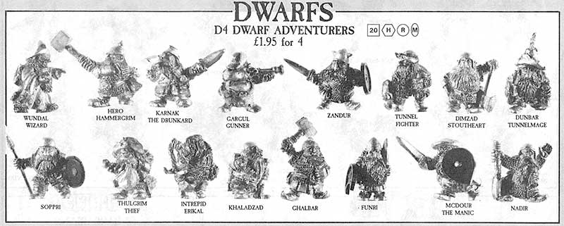
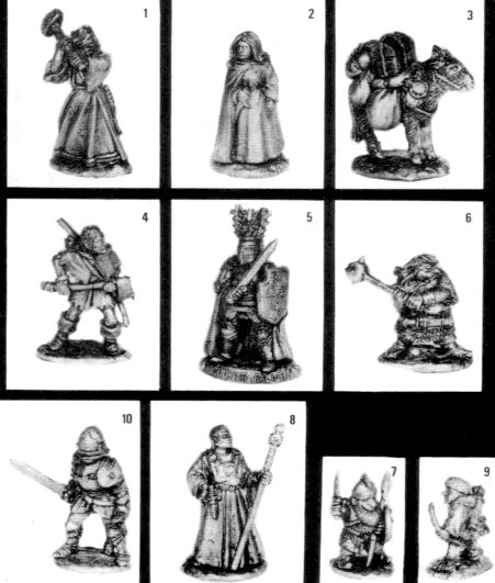
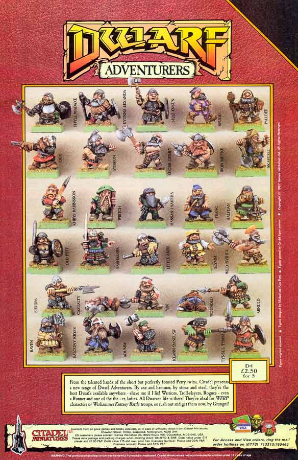
D4 Dwarf Adventurers
With the publication of Warhammer Fantasy Roleplay in 1986, there is a brief return to the theme of adventurers, again sculpted by the Perry Twins.
 |
| 1987 Flyer |
 |
| Citadel Journal Spring 87 |
These names are spread across several flyers and White Dwarf adverts.
| D4 Dwarf Adventurers | | Wundal | | Wizard |
| D4 Dwarf Adventurers | Hero | Hammergrim | | |
| D4 Dwarf Adventurers | | Kanark | | The Drunkard |
| D4 Dwarf Adventurers | | Gargul | | The Gunner |
| D4 Dwarf Adventurers | | Zandur | | |
| D4 Dwarf Adventurers | | Dimzad | Stoutheart | |
| D4 Dwarf Adventurers | | Dunbar | | Tunnelmage |
| D4 Dwarf Adventurers | | Soppri | | |
| D4 Dwarf Adventurers | | Thulgrim | | The Thief |
| D4 Dwarf Adventurers | Intrepid | Erikal | | |
| D4 Dwarf Adventurers | | Khaladzad | | |
| D4 Dwarf Adventurers | | Ghalbar | | |
| D4 Dwarf Adventurers | | Funri | | |
| D4 Dwarf Adventurers | | | McDour | The Manic |
| D4 Dwarf Adventurers | | Nadir | |
|
More loosely inspired by the Hobbit and the Dvergrtal, with slight nods to Tolkiens Dwarven language of Khudzul appearing with
Khaladzad.
Nadir, being a low-point is maybe a joke on the dwarfs low stature, and
Karnark the Drunkard reminding what the Alcoholism rules in Warhammer are there to be used.
White Dwarf 95 Dwarf Adventurers
Yet more dwarf adventurers appear in White Dwarf 95.
| D4 Dwarf Adventurers | | Adumm | |
| D4 Dwarf Adventurers | Little | Andii | |
| D4 Dwarf Adventurers | | Arnuld | |
| D4 Dwarf Adventurers | | Aydriun | |
| D4 Dwarf Adventurers | Balcony | Kryss | |
| D4 Dwarf Adventurers | | Eyunna | Lexanda |
| D4 Dwarf Adventurers | | Fhyll | Madaxe |
| D4 Dwarf Adventurers | | Halfdan | |
| D4 Dwarf Adventurers | |
| |
| D4 Dwarf Adventurers | | Khrys | Rabinsson |
| D4 Dwarf Adventurers | | Klann | Danelaw |
| D4 Dwarf Adventurers | Iron | Mhyke | |
| D4 Dwarf Adventurers | Wild | Nyjhul | |
| D4 Dwarf Adventurers | | Ogg | |
| D4 Dwarf Adventurers | | Palldee | |
| D4 Dwarf Adventurers | Old | Peet | |
| D4 Dwarf Adventurers | | Prang | |
| D4 Dwarf Adventurers | | Rashasawa | |
| D4 Dwarf Adventurers | | Raven | |
| D4 Dwarf Adventurers | | Rhobb | Grimly |
| D4 Dwarf Adventurers | | Shaz | Ensun |
| D4 Dwarf Adventurers | | Shrubs | |
| D4 Dwarf Adventurers | | Skargell | |
| D4 Dwarf Adventurers | | Slymm | |
| D4 Dwarf Adventurers | | Spudd | |
| D4 Dwarf Adventurers | | Tynsul | Tymm |
| D4 Dwarf Adventurers | | Writch | |
| D4 Dwarf Adventurers | | Yak | |
These are a strange list, quite out of keeping with the last run. After establishing the 'fantasy' feel for Dwarf names, blending Tolkien and norse myth, these are little more than funny spellings of common English forenames,
Khrys for Chris,
Nyjhul for Nigel,
Peet for Pete etc. It's entirely possible these are references to real people, perhaps gamers or Games Workshop staff, but without knowing the targets of any particular jest, it's difficult to know if we've come full circle to the
Quintins and
Corbetts of the Dwarf Kings Court, or are just scraping the bottom of the barrel of faux-English names.
There are a few names that manage to stand out:
- Khrys Robinson - Christopher Robin - owner of Pooh and son of A. A. Milne.
- Iron Mike - reference to boxer 'Iron' Mike Tyson.
- Skargell - reference to Arthur Scargill and the miniature is a miner. Been there before!
- Hassan I Sahbha - obviously an Assasin pun, also a Hawkwind song.
- Rashasawa - a portmanteau reference to Akira Kurosawa's Rashomon ?
- Ogg - a reference to the dwarf Og in the Time Bandits
It's a shame to leave our on a dull note, but overall, there are over 120 individually named Citadel Dwarfs, compared with 70 Orcs or 50 Elves, a testament to the enduring popularity and variety of Dwardom. And thus endeth this recital of the true and ancient lore of the nomenclature of the Dwarf kindreds of Warhammerland.
OK. Can I go back to calling them Dwarves now? Tolkien was right, it's more natural than Dwarfs.


