Friday 26 April 2013

Amazonia: Archeoideology


Heading back to the Lustrian jungle, for another look at the Amazons, who are of course the all-female warrior tribe, loosely based on Greek myth intermixed with a heap of contemporary 1980s influences.

C30 Citadel Amazons | 2nd Citadel Compendium


"Second wave" feminism in the 1970s created an entirely new mythology founded on completely dodgy archaeological grounds. The central story goes something like this: once upon a time in Neolithic Europe women were dominant and as women are all naturally "peaceful, nurturing and in tune with nature" they worshiped the Great Mother Goddess and humanity all lived together in universal peace and harmony. And then, boo-hiss evil patriarchal male dominated society invaded and destroyed them all, with their evil man-idea of The Wheel and enslaving horses and being male-chauvinist pigs and stuff.

Amazon Branchwalker | David Sims / Daria Werbowy | Vogue US 2010
Of course, such scenarios can only be constructed by cherry picking archeological evidence, generally making stuff up, falsifying dates, projecting folklore onto a much earlier time period than that which produced it and overly free interpretation of evidence etc. This kind of nonsense was spouted by crackpot hippy archeologist Maria Gimbutas, and is no doubt still in vogue in some happy-clappy alternative history quarters.

Fortunately someone has put an amateur documentary up on Youtube about Gimbutas so you can watch it rather than wade through her texts, it is a relentlessly pro-feminist prehistory, and provides less critical substance as the average History Channel piece (i.e. not much). Like Erich von Danikens Chariots of the Gods before it, the rhetoric is rather barefaced - notice how the the connective tissue of argument is dsicarded in favor of parading images of artifacts in front of the viewer with assertion after assertion, with no explanation of how the objects are actually related across great oceans of time. Best example putting Willendorf Venus (24,000BC) in a sequence with a piece of Greek sculpture (3,500BC) with no mention of how these artifacts could be related, they just are :


This central myth of "matriachal prehistory" as it is known, requires women to be seen as 'peaceful and nurturing' and men as 'violent and dominating' which, rather than being based on actual historical evidence, is just projecting the negative stereotyped gender-roles of contemporary society onto prehistory. As this actually does nothing to improve the social standing of women (or men for that matter), it's no wonder contemporary feminists reject it wholeheartedly as a useful mythology, but in the late 1970s, early 1980s, much of this discource' was actively taking place within archaeology - and unlike Von Dankiens  "the aliens did it" which is alternately scoffed at and ignored by academia, Gimbutas curried some favour with proper historians and archeologists of the time (typically ones promoting a feminist agenda, and those wanting to just point out how ideologically constucted our notions of pre-history are).

The slightly less imaginative bits of Gimbutas writings (largely about migrations of people in the neolithic period) do still have some currency, although in the decidedly dodgy area of Aryan racial origins, the beloved field of many a right-wing extremist. Amusingly it's centered around invasion of eastern europe by the Kurgans. Which is totally hilarious, as any fule kno the Kurgan look exactly like some 1980s Chaos Warriors sculpted by by Aly Morrisson:

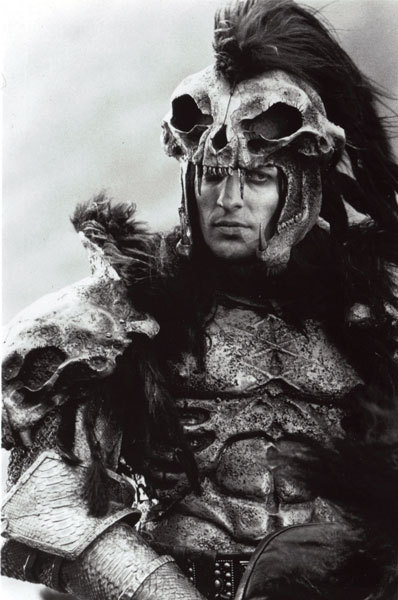
Prehistoric Male Chauvanist Kurgan of Khaos
Highlander (1986)
In her later book "The Language of the Goddess" Gimbutas does some quite frankly maddeningly bad semiolgical analysis of symbols created by stone-age people, such as claiming Ox heads represents the female uterus, (the very identification of which would require medical knowledge and surgical skill not otherwise in evidence with the neolithic people she's dicussing)  and that images of double-headed axes are not axes at all but actually butterflys and therefore symbols of regeneration (rather than obvious instruments of war), and well, that any triangle represents the female generative anatomy. One is reminded of Sigmund Freud's, "sometimes a cigar is just a cigar". Obviously I disagree with Gimbutas  interpretations as being anything other than a personal delusion and their applicability to actual history to be nonsensical, but such notions are potentially interesting fodder for fantasy gaming and world creation.

WH40k: Waaaargh the Orks Goff Banner
according to Gimbutas, this is a uterus and a butterfly
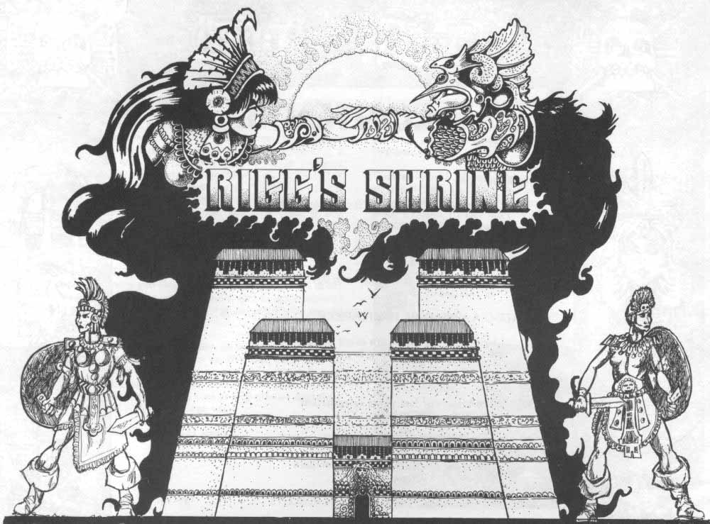


Riggs shrine

But returning to our Lustrians and  the Second Citadel Journal. If we skim over the Shrine of Rigg,  we see that the scenario centers on the conflict between greedy violent male Norse raiders seeking treasure, and primitivist eco-feminist Amazons, who are scientifically (they have high technology), spiritually (they can physically manifest their Goddess) and morally superior, defending their home and prehistoric cultural heritage.

The scenario essentially reproduces the core discources of feminist archeology: On the one hand we can read the Norse as a portrayal of the male archeologist as  looter and defiler of ancient acred space (the Shrine), and the female as a  preserver of history and culture (ancient technology and its manuals), and on the other hand this is also a reproduction of the central Gimbutasian myth of invading male aggressors (Kurgans) on an otherwise peaceful and indigenous matriarchal society ( indigenous Proto-Indo-Europeans).


Men are from Norsca, Wymmin are from Amazonia | John Blanche | 1984
Punks, Old Market Square, Nottingham, 1983.| via Nottingham in the 80s


Whether engaging with these academic, archeological dialogues was part of Richard Halliwells intention, I do not know. I know Rick Priestly studied archeology. The chances are it is nothing so deliberate, but rather a just a melange of cultural influences of the time. And that's one of the advantages of approaching these texts in 2013, rather than 1984, having enough distance to look at the patterns and see it as part of a wider cultural dialogue.

Putting matters of intentionality to one side, I would argue  the myth of matriachal prehistory is exactly the kind of ideologically constructed pseudohistory that is ripe for developing fantasy (Tolkiens conceptual and discarded Mythology for England project by way of example, or Nazi UFOs for another). So rather than playing out the Napoleonic Wars on Mars or Space:1945 Warhammers Lustria could be seen to be gaming with the text of 1980s Gender Wars and the myth of matriarchal prehistory.


Amazon Tracker | Daria Werbowy | Vogue US 2010

Gimbutas bronze-age feminists were completely peaceful with no weapons - while the same cannot be said of Halliwells Amazons, who are most certainly armed. However, they do not seem to have a formal, standing army. The "warriors" are either priestesses, with ceremonial weapons, tribal hunters -with bows and arrows and hunting knives or bodyguards with spears. We are informed that the Amazons lived peacefully alongside the Old Slann (the only other faction existing in Warhammer prehistory), although that peace has now ended since the collapse of the Old Slann empire. Also, like Gimbuas' imaginary prehistoric Goddess, the Amazons are mysteriously self-generating, having no males to produce their offspring.  If we are to take our radical-feminist reading of the Amazons back in time from the fantasies of the "second wave" we can see in the Suffragette movement a potential parallel of the Amazons access to advanced technological weapons as the militant members of the Women's Social and Political Union being known for arming themeselves with hand guns... but I'll save that for another post


OK, so that;s the narrative, but what does that mean in gamist terms? I hear you ask. Well, I've updated the Tribeswomens stats from 1E to be compatible with 2nd/3rd edition (that's the 2E S+T kicker and numerical T), and points value calculated as per the Oldhammer Points Value calculator so we can make some numerical comparisons.
 
Attribute
M WS BS S T W I A Ld Int Cl WP PV
Man
4 3 3 3 3 1 3 1 7 7 7 7 5
Amazon
5 3 3 3 3 1 5 1 7 7 7 7 6

So the 1E Amazons are faster than men, both in that they can move further and will attack first. So while not exactly representing gender equality, nor going over the top to make them overcompensated fetishised super heroines as in the dominatrix mould that plagues current representations of the female in current Warhammer imagery either. although the bonuses to speed and agility are within the gender-role norms (i.e. why not excessive Strength or Toughness?). Again a useful comparison to  Dungeons & Dragons may be made, where feminine characters Strength is capped at a lower than the masculine, wheras in Warhammer these are equal.

| John Paul Gautier 2010
It should also be pointed out that while Amazons are female, they are not strictly human. Whether this itself is a distancing of the feminine from the center of the Warhammer mythology, or even a product of the literal dehumanising of the feminine can only be seen in how the individual relates to the 'otherness' of the faction. In Riggs Shrine, for example the Norse are largely unsympathetic gold-hungry raiders, albeit cast very much in the murderer-hobo vein of the D&D adventurer which gamers of the time were reasonably familiar and comfortable with. In this context, the usurping of the milieu from the expected Orc / Bugbear / Evil Cultist infested dungeon  (c.f. the Caves of Chaos in Keep on the Borderland) to a holy place run by tribal women goes some way to show how radical a departure from traditional fantasy adventure gaming Rigg is.*


In this kind of reading, fantasy gaming becomes more of a socially aware text than pure escapism and can even be seen to have a socio-political dimension. And of course, the idea of radicalised female tribal warrior still has currency today, as I hope the photos of Daria Werbowy and the 80s Nottingham punk scene illustrate...


*unless of course, the Orks are Goddess worshipping Orks with diagrams of a uterus on their banners, and the cave itself a symbol of deep feninine reproductive ability, into which the adventurers must delve... anyone done a freudian analysis of Gygaxan gaming? 


Again, let's finish this trip to Lustria with  a look at every ones favourite 1980s Franco-Japanese Greek-myth in space cartoon series, Ulysees 31. In this episode (#23: Calypso) Ulysees lands on a planet entirely inhabited by a race of alien women. There has been some discussion about the emotional weight of this series in the comments, and I feel it only justified to warn you that not only do we see clearly adulterous intent on the part of Ulysses,  several people die - on camera, and we also see our hero cry.

"Melancholia Factor 10, Captain".


Sunday 14 April 2013

Otherworld Adventurers and Dragons

Unboxing the crowd-funded Adventurers box set...

Here is a box...


inside is a... carrier bag! I recognise that picture...


There's another one in here...
What's this at the bottom..
Ooh, extras, wardogs, familiars, henchmen, treasure...
Dwarven mercenary (by Des Hanley) in a very naturalistic style. The familiars are tiny, very naturally sized for the miniatures and the birds are particularly nicely done. Treasure chests come with a single 60mm base, the large one is a huge solid lump of metal. The Henchmen, characterful, overburdened red-shirts, unfortunately there are no coconut shells in the conversion pack (something to do with the speed of a migrationary European Swallow methinks), but there are weapons. Generic men-at-arms and pack carriers these are not.... there's some nice photos of the raw metal on Erny's blog, go have a look.

Out of the bag, the back of the Adventurers Box 1 sleeve back

Front of the Adventurers Sleeve Front
Carry case - the "glow" on the comet looks better than this photo suggests.
Inside the carry case - miniatures!
The sleeve fronts all feature a digital painting by Victor Perez Corbella and other graphic adornments by me.

Not going to say much abut these right now, they're all sculpted by Kevin Adams, and they are all very, very good. At some point I'll do some scale shots with some RBG and some 80s Citadel (more than likely Talisman and 80's LoTR and maybe some solid based ones too) they come with separate backpacks and most with separate weapons and solid flagstone bases. Nice photos of finished painted miniatures on the OW site.

DAB2 - Demi-humans front


DAB2 - Demi-humans back
Again, similar thing going on with DAB2 - and photos of the painted miniatures.


The other big new release of the quarter is the start of the Dragons range (a planned series of 12 chromatic, metallic and ...) Again the sleeve design is my work, I'm really happy with how the "Dragon" logo turned out, and hopefully it will turn out a useful and flexible device for the whole series.

DGN1 Sleeve front and DGN2 Sleeve front

DGN1 Sleeve back


DGN2 Sleeve back


Again, as with the DAB boxes the front features a digital painting by Victor Perez Corbella  and graphic embellishments by me, and the back has a photo of the contents by Richard and a border by me (this has more direct reference to a classic piece of D&D art - guess what?!?).

DGN1 - White Dragon Human Fighter

DGN1 - White Dragon Human Fighter

The White Dragon is a beast, there's a really nice feel of large lizard - and recalls the late 70's Airfix dinosaur kits I had as a kid. To me that's a good thing, there's a kind of naturalism to the monster that comes through the textures and sculpting. This dragon is less of a mystical beast, more of a force of nature, a semi-intelligent animal, it's 'realistic' while obviously reflecting some classic RPG artwork. The cast is clean, and the pieces fit together reasonably well, there will be some filling, but as the cuts occur mostly in natural place (like in between scales) this shouldn't be too much of a problem.

The Black Dragon is lovely also, but he is a real hefty beast who wouldn't hold together no matter how much Blue-Tack I used. There is a difference in price between these two, and I reckon it's all going into the bulk of this guys belly. With that in mind both of the dragons will need drilling and pinning, so serious models,  not like the plastic kits I had when I was a nipper at all...

Monday 8 April 2013

What if... TSR had published Rogue Trader

TSR were the giant of roleplaying, the creators of D&D, and the originators of the gaming boom which gave rise to Games Workshop, which begat in the late 80s, a war filled future where there was only grim darkness...

Eldar | Tim Wright

When RPG stalwart Ken Rolston wrote a brief article on using 40K:RT as an RPG, entitled "Orcs in Space!" in Dragon magazine 149 he offered us a glimpse of what might have been. New Romantic Eldar, with asymertrical hair-cuts, grizzled space Truckers and cyborg Squat rednecks  and lots of sawn-off shotgunts (incredibly effective in bording maneuvers, rips holes in space-suits, airlocks, all those little bits of shrapnel whizzing around in zero-g).  Of course TSR had branched into science-fantasy territory with Metamorphosis Alpha, Spelljammer, Gamma World, Star Frontiers and quite a bit of AD&D really, so was no stranger to the genre.

Space Truckers | Tim Wright

It's very rare that another publishing house other than Games Workshop (and it's subsidiaries) does anything with its systems. Ken gives us some simplified roleplay rules, adding detail to the wound charts, and some interesting scenario outlines. I was going to fake up some covers in Photoshop and write this post like a parallel universe review of lost manuscripts and concept art, that I'd 'found' in a lot of obscure stuff I'd got off eBay. Then I remembered how upset people got with Living Stone, and decided better of it, so heres a summary of some of Kens suggestions.

  • RT01: The Lost Legion - answer a distress call from an astropath asigned the Eyes of Fire Chapter of Space Marines, over-run by Tyranids on a hostile planet caught in a warp-storm. 
  • RT02: Orcs in Space, it's Full Metal Jacket / Starship Troopers, in space with Orcs. 
  • RT03: Blows Against the Empire: A Rogue Trader sent to ensure the of a mineral rich feudal tech level planet on the edge of the Imperium, amidst Eldar Pirates, radical conservative Squat mechtech and anti-Imperium forces.
  • RT04: The Warrens Beneath WarpSpace  

The great thing is how Ken seems to have grasped what is cool about Rogue Trader: the Imperiums fragility, planets lost in the warp, the endless possibilities, warring factions, the lack of any over-arching plot, Rogue Traders sodding off into the wild unknown frontier of space like some  Trading Company of the 17th Century trying to keep hold of Empire through economic means, dumb, brutal Orcs, a bureaucratic Empire,  Small stories in a huge universe. Good stuff.

And Tim Wrights illustrations, not overly gritty or punky, have a clean, American feel to them, born of Truckers and Bikers, not as manically deranged weirdo alien bastard Others, nor as scummy debased Dave Lister types, but as empathetic, wholesome good ole boys and likeable rogues, sexy sophisticated urbanites and heroes of the New Frontier.

Squat | Tim Wright


▲▲▲WARNING: RESTRICTED ACCESS ▲▲▲
CITIZENS WHO TAKE THEIR GRIMDARK SERIOUSLY SHOULD SCROLL NO FURTHER


And then. 5 Years later. April 1st, 1994, TSRs house organ Dragon Magazine (#204) ran an article on "Dance Steps for Space Hulk" by Allen Varney:

Dance Steps for Space Hulk: Jim Holloway

You cannot unsee what has been seen.

 Jim Holloway just casually turning the camp factor of the Ultramarines all the way up to 11. And there are rules, pages of rules, detailing how Space Marines can foxtrot, bat-dance and tango in a hulk. Good job on repositioning the competition TSR.


ATTENTION CITIZEN
HERESY HAS BEEN DETECTED
PLEASE REPORT FOR TERMINATION
PRAISE THE EMPEROR

Wednesday 3 April 2013

T-Shirt Update

The next chapter in the ongoing campaign against naked gaming. First off Barrowmaze T-shirt:

Barrowmaze T-shirt - click for bigger!
The T-shirt features an insane undead cultist, a mongrelman, a dracoliche, a giant skull, a  and a fallen-hero skeleton warrior, falling masonry and letters made out of bones. Hopefully you'll be getting some psychobilly / metalhead vibes off it. If you're not sure what Barrowmaze is all about, it's an old-school D&D dungeon-crawl focusing on the pillaging of a massive network of underground barrows - there are reviews and previews of Barrowmaze on RPGNow. The module features lots of undead, cultish factions and insane artefacts of insanity written by Greg Gillespie with artwork by myself, Stefan Poag, Jim Holloway, Trev Hammond and many others.

Greg is funding the printing of a selection of T-shirts through indigogo, and there are a few other designs up there too, from the Mighty Pen of Poag and Jumpin' Jim Holloway - all Old-School themed and very nice they are too. They cost about $25 / £17 including US/CAN postage, but European postage will be additional.

Barrowmaze Gamer T's on Indiegogo

And secondly, my order Oldhammer ov Khaoz Tzhirt arrived, and here's some dodgy phonecam shots...

chaos fire on beastman.


You can see the "grain" that the print has, a slightly speckled effect, which is quite nice, and there's a tiny bit of ghosting around the edges of the lettering - less than 0.5mm. I think there is a substrate of white that is then printed over in colour - Spreadshirt are not very good at explaining their printing processes or explaining how to get best results, they also only except vector graphics or PNGs, which are RGB, so how the colour gets interpreted is a but hit and miss. Anyway,  enough design nit-picking, I'm very happy how the details in the drawing came out and the colour of the piece, and will gladly wear this down the pub as soon as the weather sorts itself out.

If you're looking at my chest this close, you're standing too close.

But I did get the opportunity to experience Spreadshirts return policy as I found it a little too tight across my ever expanding middle aged gamers waistline.   So I emailed Spreadshirt, said it didn't really fit properly and could I get an L. They responded the next day and said I could either  keep it and get a £5 voucher off my next purchase OR return it to them and get a L and attached PDF form to fill in and print out and put in so I packed the t-shirt back into it's packaging and shipped it off (at a cost of under a quid for Large Letter) and  few days later an L appeared, which is a much better fit. I don't know if that's their standard procedure, but it does give me confidence that Spreadshirt are doing the right thing.

All flavours of T-Shirts are available, again black is proving the most popular, but the Warhammer Wives Club seems to be very slow in getting in on the action.  

UK & Europe from: http://zhu-shop.spreadshirt.co.uk/

And a slightly more limited range in the USA and the Rest of the World from http://zhu-shop.spreadshirt.com/


Tuesday 2 April 2013

White Dwarf The 80s Soap Opera

Was 1980s US TV series Dynasty the unlikely design inspiration for the 2012 White Dwarf revamp?


Yes, it was.

It appears that 1980s TV series Dynasty and subsequent spin off The Colbys provided the design inspiration for White Dwarf magazines recent revamp (since #394). Through use of  colour and typography the new White Dwarf is eerily familiar to aficionados of trashy camp 80s pop-culture. The new White Dwarf masthead is relentlessly set in the yellow / orange / gold end of the spectrum and utilises the the exact same font as the Dynasty titles - Aurora, designed by Jackson Burke in 1960. Both designs also use just the one font throughout the layout, not only for the masthead "White Dwarf", as the programme title "Dynasty" does, but for the featured contents of the magazine, as the TV show does for the actor names as well. Compare with something like Doctor Who, which has a unique logo for the series title and separate font used for the episode title, with earlier White Dwarf that likewise have a similar split between masthead and cover copy.

Not only that, but I'd suggest the new art direction is also mirroring the fantasy of wealth, ownership and the conspicuous consumption of status-symbols that Dynasty invaded our 1980s analogue televisions with. The traditionally painted fantasy scene, with its long tradition going back to the depiction of historical battles and pulp sci-fi novel covers - and a long standing motif of the White Dwarf cover - has been replaced by the highly mimetic, representational imagery of product photography which is not at all unlike the sequences of high end consumer lifestyle goods paraded behind the characters in the title sequence of Dynasty.  Although with the Dwarf it is toy soldiers, not diamonds, Rolls Royces or real estate that define the corpus of the Games Workshop consumerist fantasy. So the White Dwarf cover has gone from imagery that depicts a fantasy world of the imagination, to imagery that depicts an aspirational collection of objects. Not to mention there are some genuinely laugh out loud examples of Freudian imagery, from oil wells to champagne bottles, to big guns and long necked daemons to consider...

And you thought Space Marine shoulder-pads were ripped off Judge Dredd, but no, GW have finally let slip. It was powered armour  = power dressing all along...